DEWAR’S -
BRAND BOOK
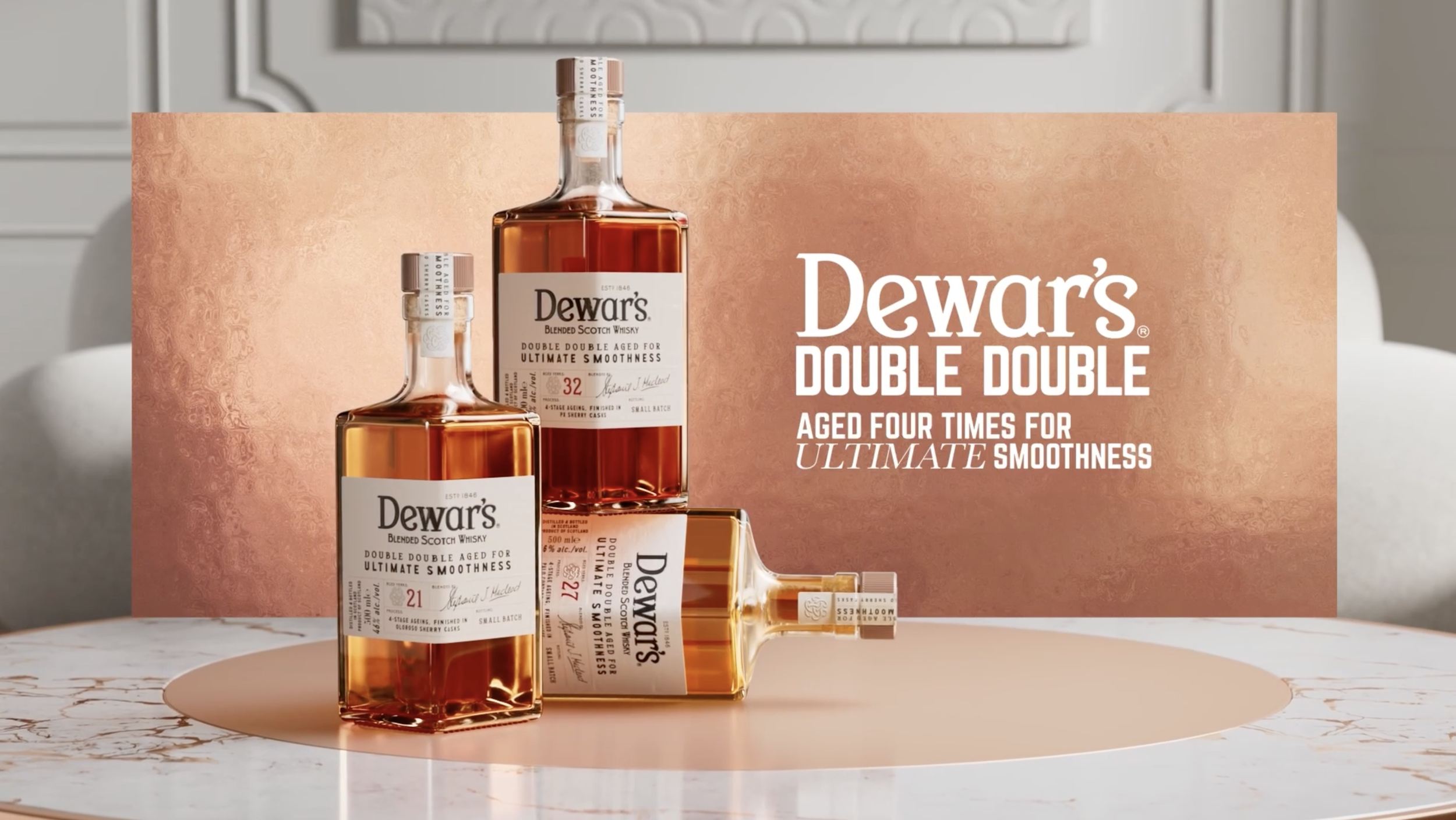
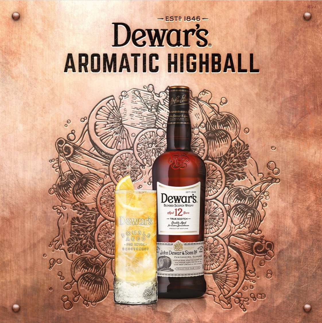
As Dewar’s evolved, its visual identity had accumulated a range of textures, flourishes, rivets, and etched details that made the brand feel increasingly fragmented. The challenge was to bring a sense of modernity and refinement to Dewar’s while creating a more cohesive identity across its core and premium ranges.
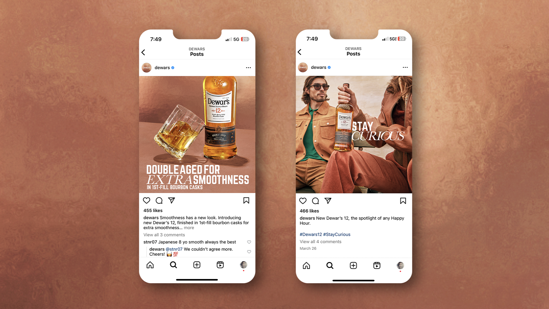
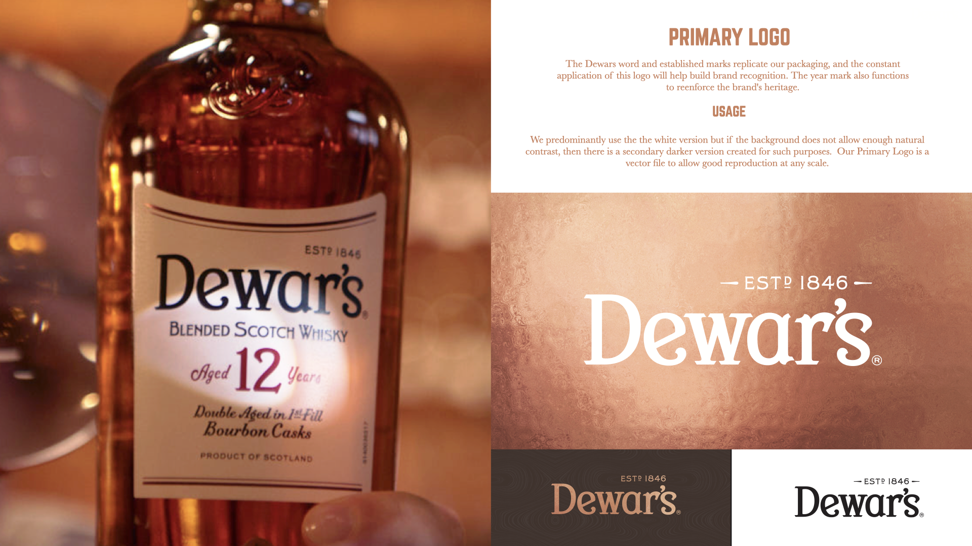
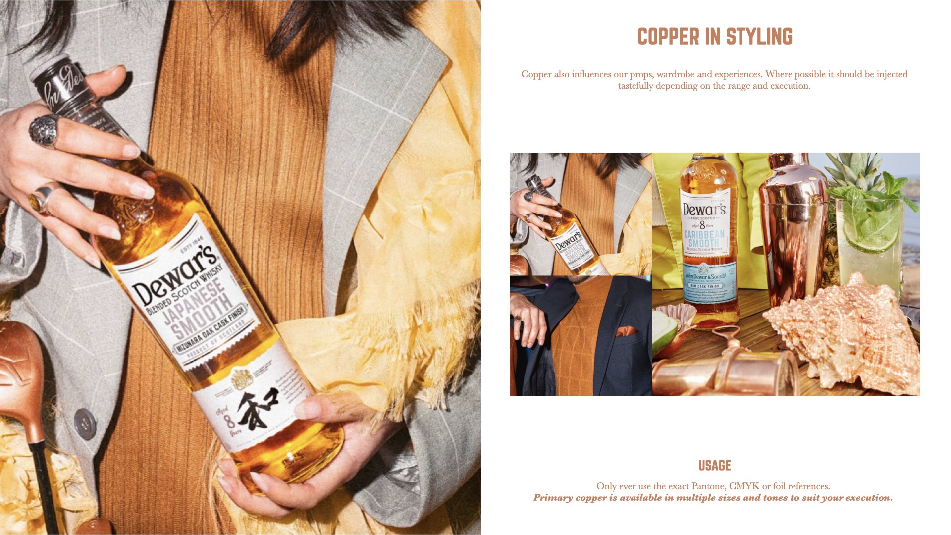
The rebrand stripped the identity back to its most distinctive elements, creating a more considered visual language inspired by quiet luxury. I helped develop the new brand system, including a refreshed approach to Dewar’s signature copper, typography, and visual hierarchy. By giving greater purpose to secondary typeface Baskerville and establishing flexible design systems across Dewar’s, Cask, Core, and Double Double ranges, the new identity created consistency while allowing each range to maintain its own character.
PRIOR TO THE DEWAR’S REBRAND
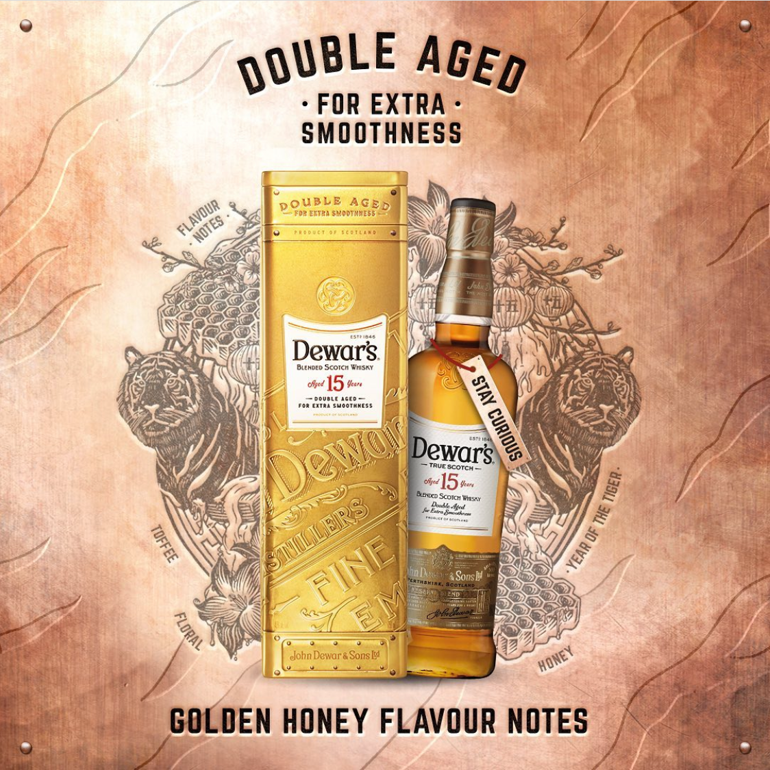
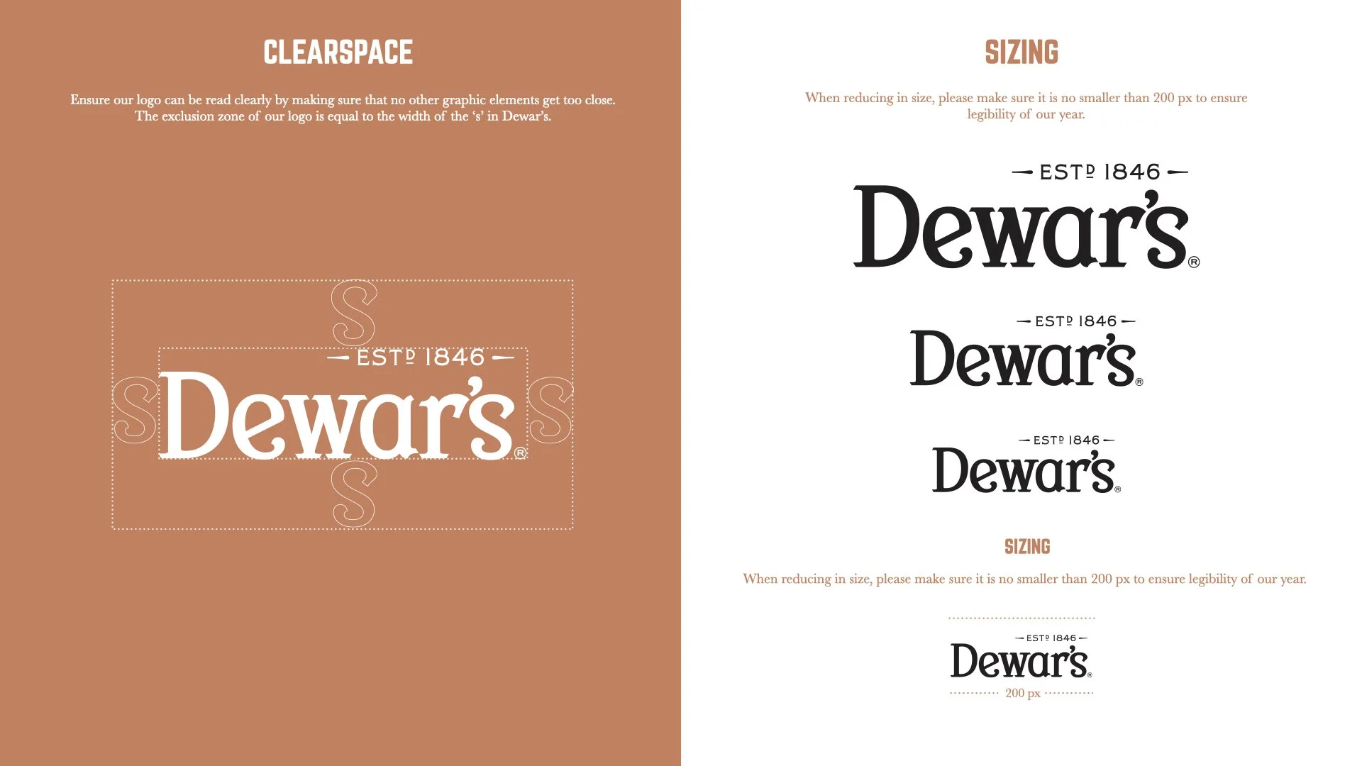
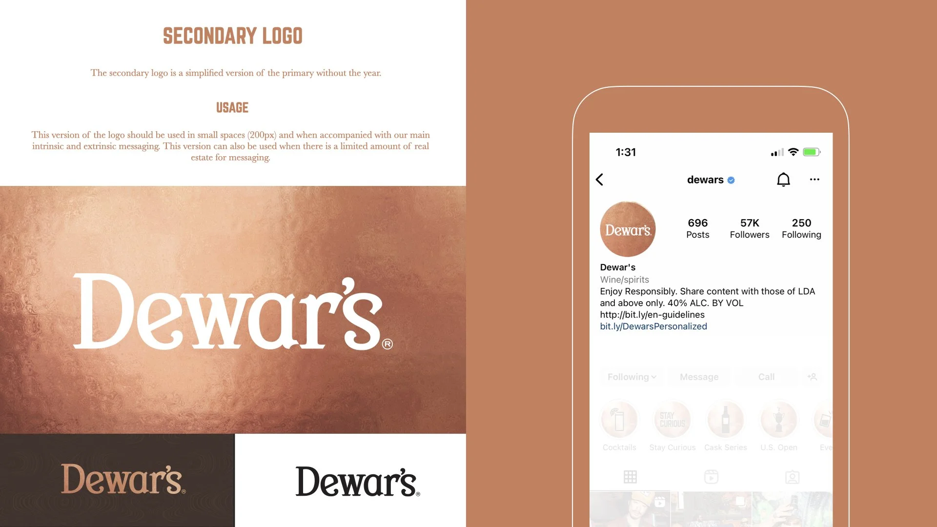
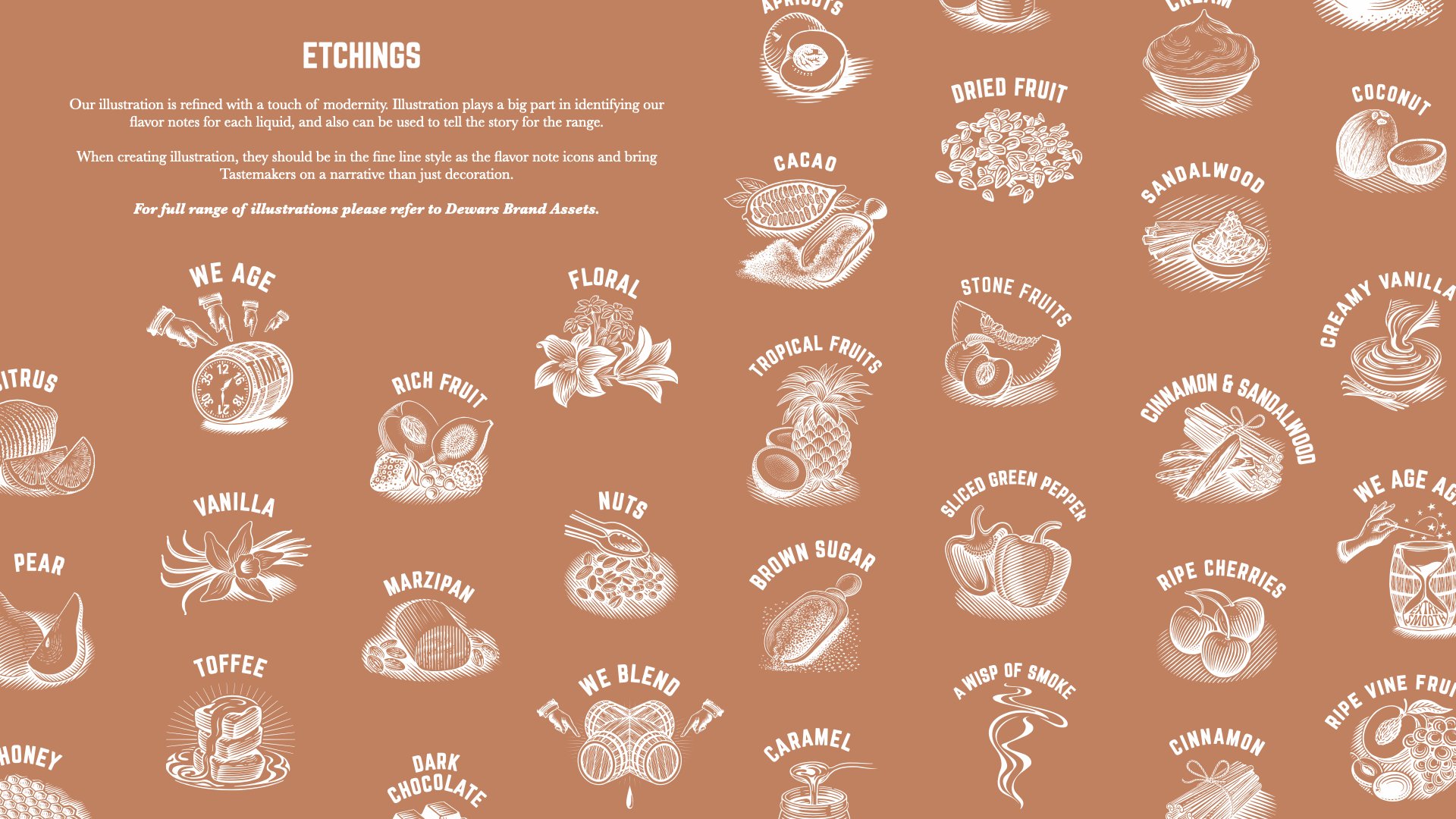
REBRAND GUIDELINES:
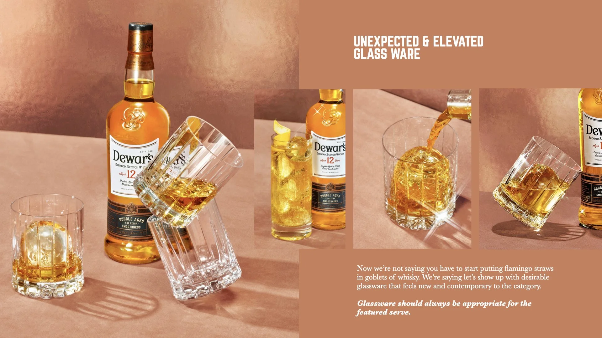
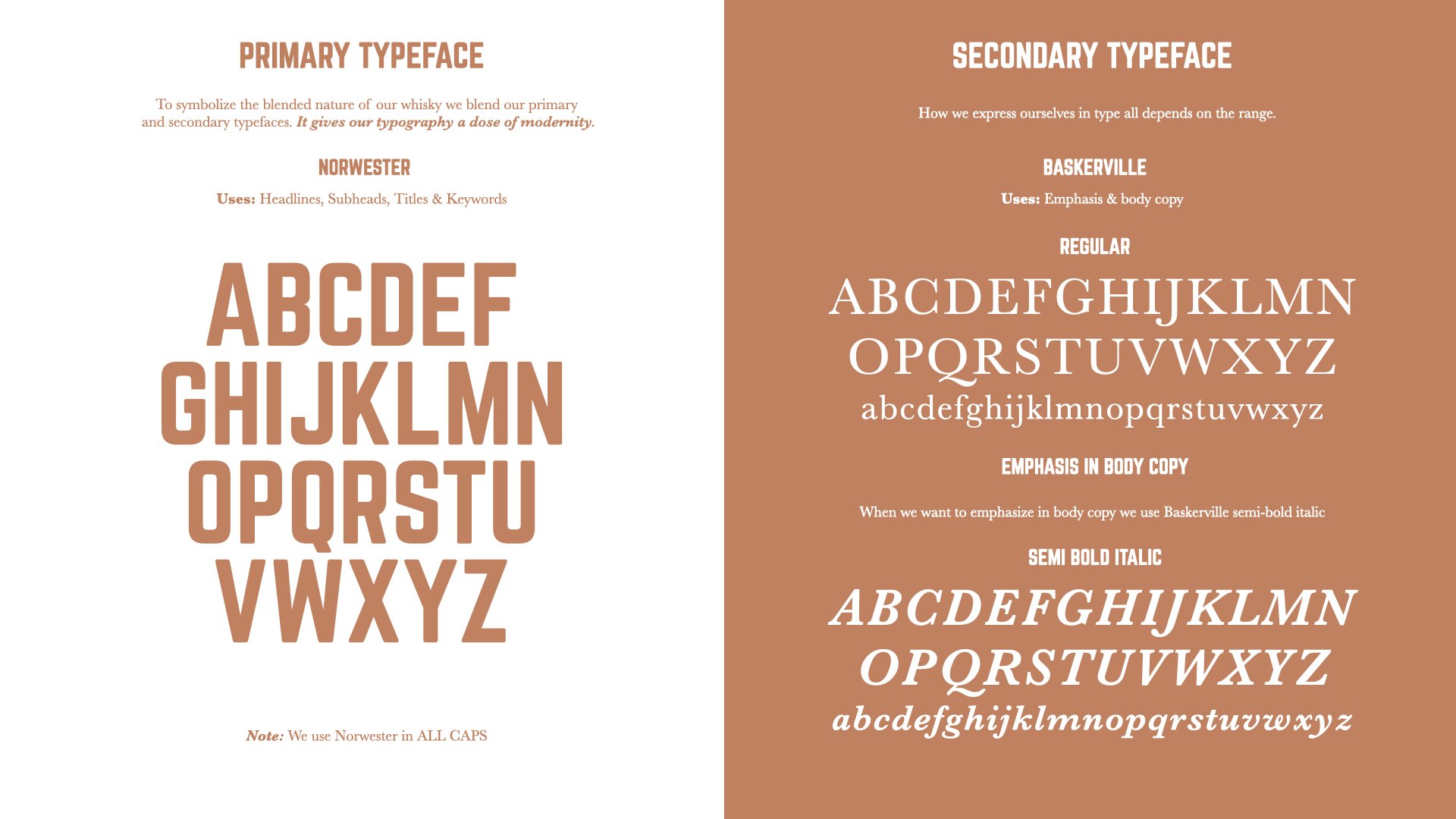
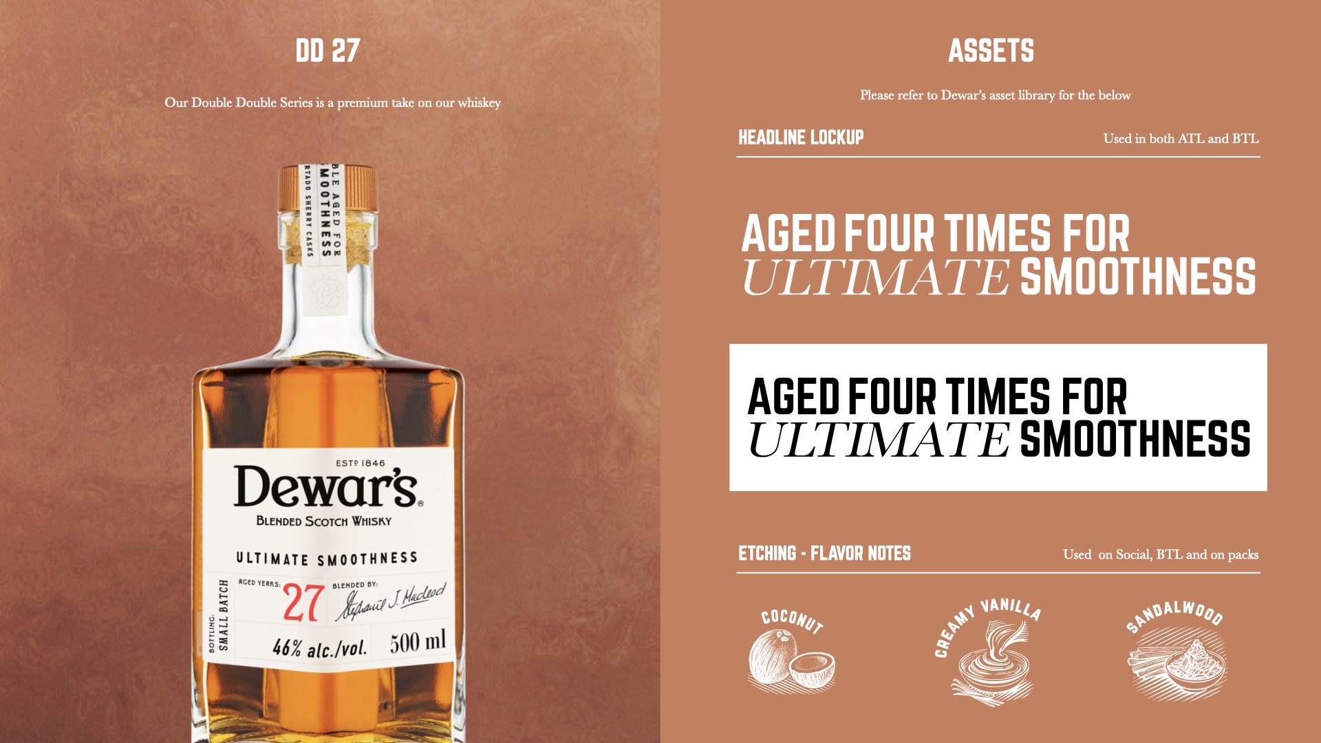
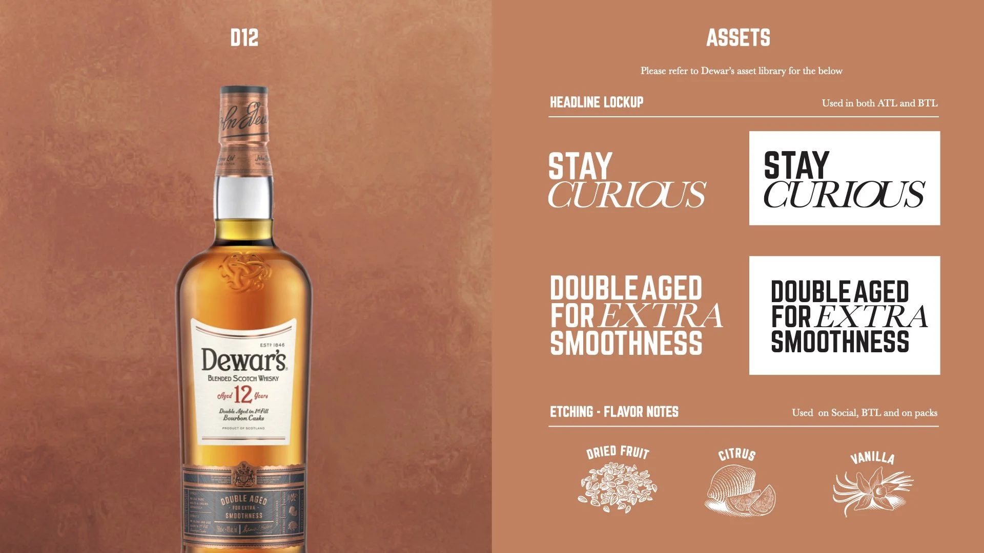
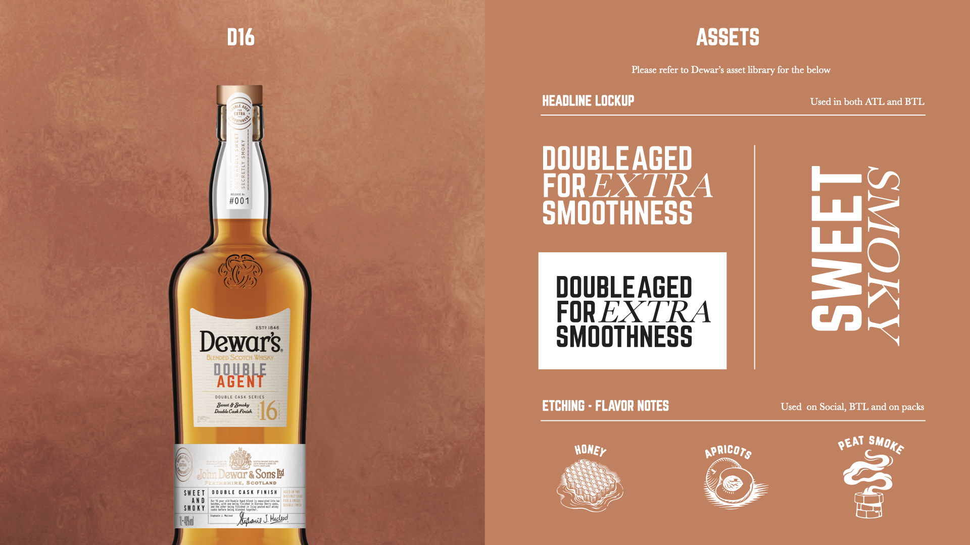
Here is how the Dewar’s BVI came to life: